BusyBus
A real-time solution for local transportation.
Jul 2019 - Aug 2019
Research & Discovery
Info Architecture & Ideation
Interactive Design & Testing
Visual Design
Frontend Development
Google Forms
Figma
Atom
Git / GitHub
Transit officials identified a problem they would like to solve. Due to expansion, numerous bus routes were recently added and many of those routes stop at the same bus stop. Riders want to know what the next arriving bus is and how much time they have to get to the bus stop. Riders and residents are frustrated and want to know where their bus is, when it arrives, and how long until it departs. The problem can then be stated in the following question:
Video by Adán García from Pexels
Riders and residents are frustrated and want to know where their bus is, when it arrives, and how long until it departs. The problem can then be stated in the following question:
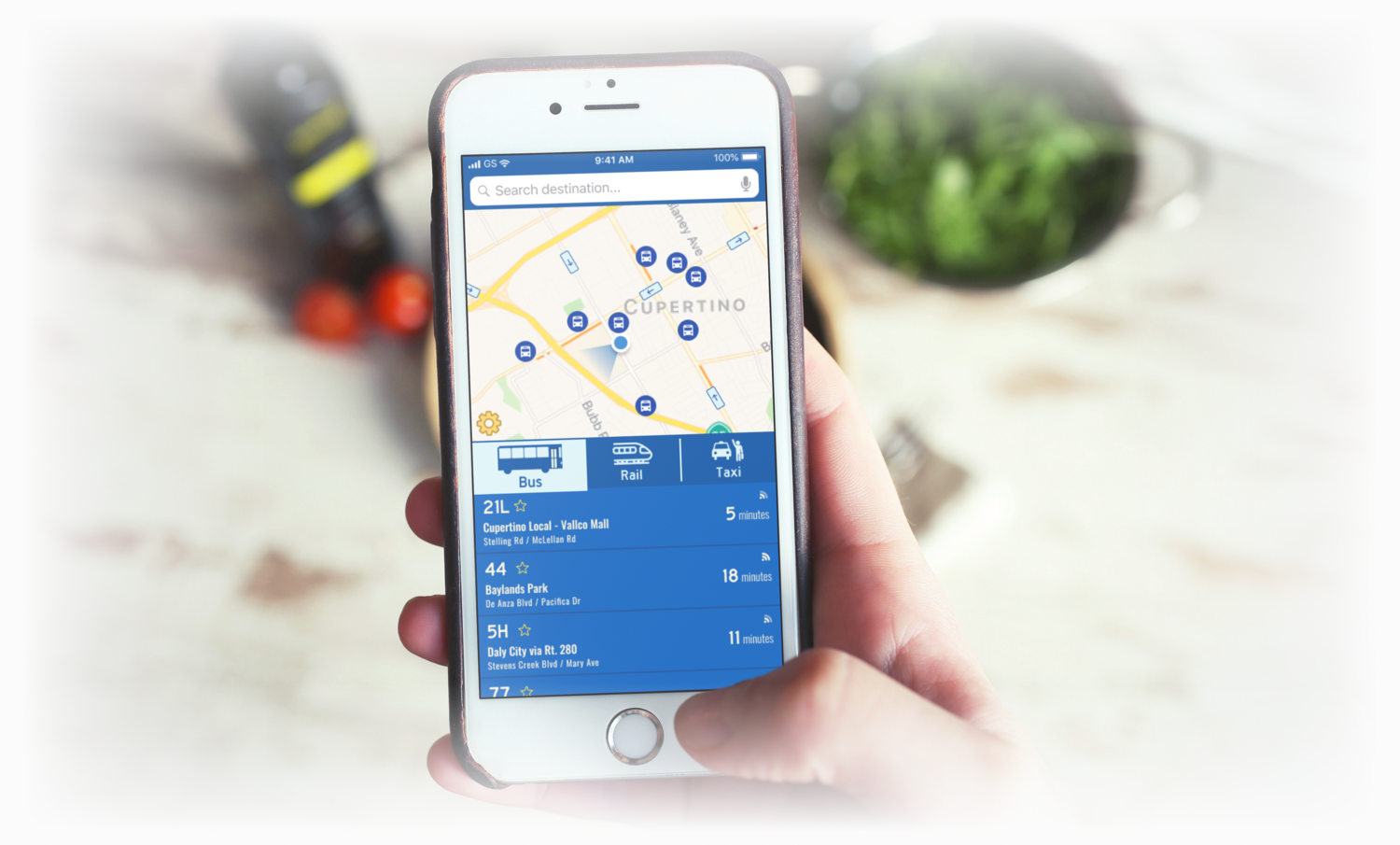
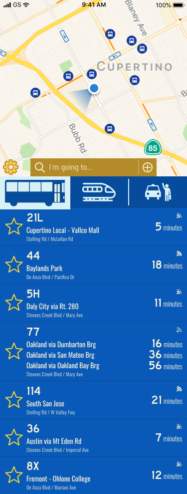
BusyBus was developed with the aim of providing residents and commuters with a technological solution that provides a more seamless and hassle-free public transportation experience. By combining basic design principles with an intuitive layout, BusyBus’ interface lets users know in real-time when their desired buses will arrive. Users will also be informed of inactive routes.
survey
responses
plan with
an app
wait 6+
minutes
live near
a stop
survey
responses
plan with
an app
wait 6+
minutes
live near
a stop
From a survey of 32 people, most people do not use the bus as their primary mode of transportation (81.3%), while 18.8% reported that they do. Focusing primarily on bus riders, 50% use it daily while 50% use it a few times a week, mostly for getting to work. Most riders walk no more than 5 minutes from their homes to their stops (83.3%), but time spent waiting for the bus varies; 16.7% spend 0-5 minutes, 66.7% spend 6-15 minutes, and 16.7% spend 16-30 minutes waiting. This is where improvements can and must be made; the graph below shows what ways users' experience using public transportation apps can be enhanced:

Bus riders will benefit from having real-time updates so they know when to expect buses, and would like to track them in real-time (similar to how Lyft and Uber rides). Users also wish to know when to begin heading to their stops, and be notified of any changes in the expected time of their bus. This will reduce wait times, diminishing a major pain point. In the event of a signal failure, users would also like offline access to schedules and routes so they have some idea of when to begin moving. For added convenience, and because not all apps have this feature, an in-app payment option will attract more users.
I compared two products that people use to get around, both varying in popularity. Google Maps is widely available and accessible, but does not utilize color as much as Transit does. For example, Transit mirrors the MTA's color map for its various subway lines when looking at routes. Transit has the added benefit of also having real-time updates, when local buses arrive, and when buses after the next would come as well.
How do we measure success for BusyBus, taking competitors and user requirements into account? I created a list of 12 user stories that were most important in establishing a minimum viable product, including being able to see real-time updates, notifications or approaching buses, and adding items to a 'Favorites' list. From this list, I created a user flow that integrated as much as possible to test out general functionality.

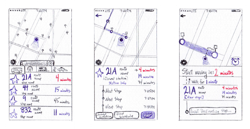
Time to sketch and test! Using a templated worksheet, I sketched out three screens that adhere to my user flow and performed usability testing on this paper prototype with three public transportation users. I experimented with including other forms of transportation for users who may want to explore those options, similar to Google Maps and Transit. I asked them to select and confirm a bus route. They each had varying levels of technological proficiency, allowing for broader perspectives on what could be improved. I noted the following points of feedback:
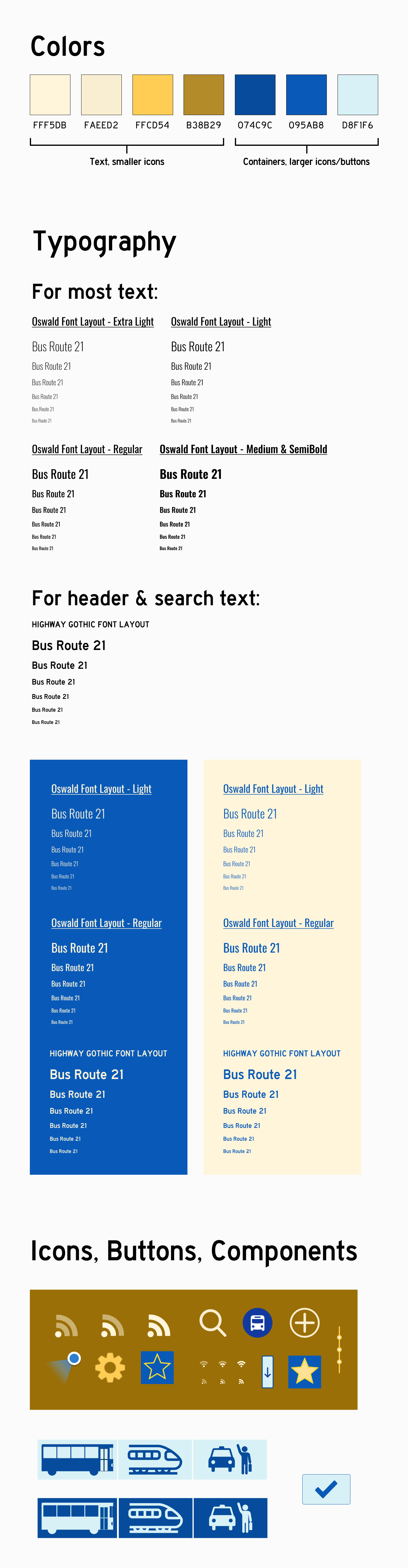
I wanted to convey to riders that they can trust and be excited about public transportation. I therefore used shades of blue as my primary color palette (blue denotes trust and security) and shades of yellow for my secondary palette to emphasize enthusiasm. I used a Highway Gothic for my brand type and Oswald as its complement. Highway Gothic is used for US highway signs, and thus felt appropriate to use for this project. I applied this type to the search field text, route numbers, and the times' numerical displays. All other text used Oswald with 5% letter spacing.
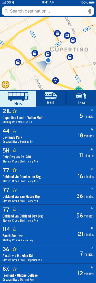
When creating the visual prototype, I combined the subway and train buttons into one button based on user feedback. This helped to avoid confusion moving forward. On my sketches, I reserved space for route names to be next to their numbers, but I realized it won’t be feasible here. I instead placed the route name under the number, and above the stop name I applied a darker background with lighter text. Some aspects of my sketches did not translate as well to the visual design as I anticipated, and thus the design underwent a second iteration. Some points of feedback from other designers were as follows:
Iteration 1
Iteration 2
Mobile Prototype
I played the role of developer to understand how design translates to code. Using Atom, I wrote the HTML and CSS for BusyBus' main screen. When looking back to my Figma design, I noted that the settings icon bled into the map, making it difficult to spot. I therefore altered the icon's appearance, using blues for the background and outline, and a drop shadow. The route data was also restructured to display based on direction, with reroutes and out of service lines at the bottom of the list. I added a cap on the page width to see how everything would expand from mobile to larger displays. Needless to say, this endeavor opened my eyes to how essential it is for designers and developers to be closely involved when working on a project together!
Spacing and font manipulation were among the biggest challenges going into the visual design of BusyBus. This demonstrated the importance and value of iterative feedback. This project felt different from others in that it was very focused on a very specific issue, requiring only one task to be tested. Manipulating space was also a challenge during frontend development, and coding the transit type buttons to invert colors on hover/tap presented an entirely new challenge in itself. It required use of .SVG files that I was able to download from my Figma project and manipulating the source code to get the desired effects.
For future consideration, I would build in a toggle between dark and light mode, giving riders more control of their viewing experience. I would also continue experimenting with typography to see if there are better hierarchies I can apply. Ultimately, BusyBus does answer the problem statement by giving users accurate and real-time updates for local routes, assuaging any concerns they have about missing their bus.