Oct 2019 - Jan 2020
Research & Discovery
Info Architecture & Ideation
Interactive Design & Testing
Visual Design
Google Forms
Figma
inVision
The Noun Project
UsabilityHub
A client was excited about potential in the cloud storage market and had a list of features they would like to include in the end product. It was up to me to cement a foundation for this project through user research and discovery, followed by ideation and testing, then applying branding, visual elements, and retesting to develop a fresh competing product. This final product should enable users to:
As such, we can rephrase the client brief in the following problem statement:
Video by cottonbro from Pexels
This final product should enable users to:
As such, we can rephrase the client brief in the following problem statement:
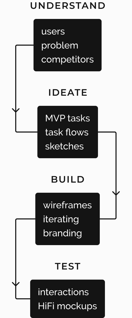
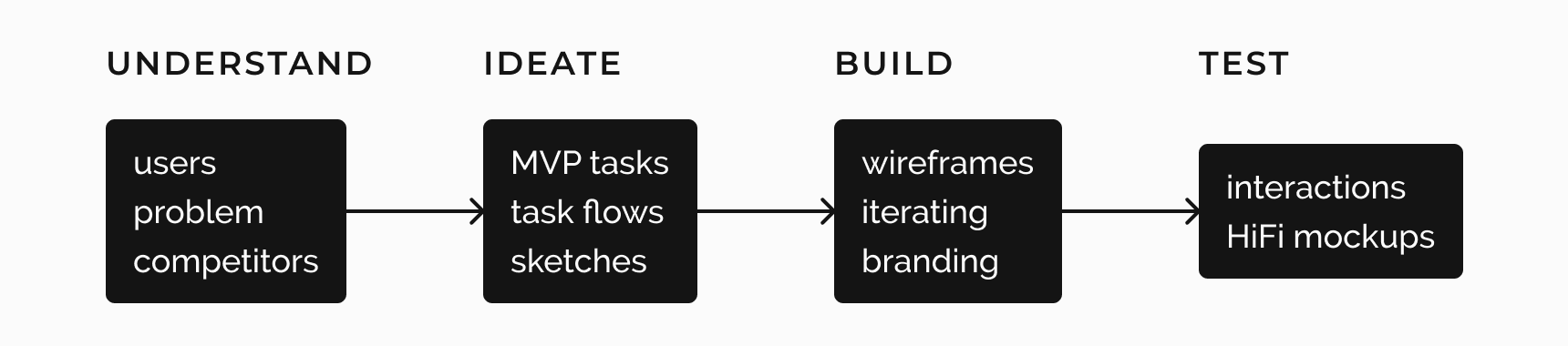
These were my steps for tackling this project:
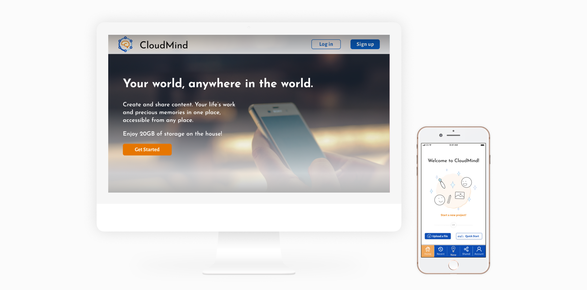
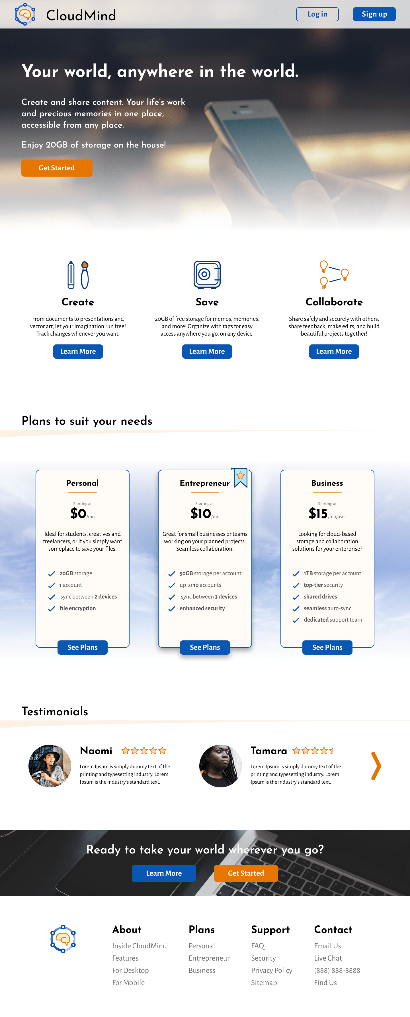
CloudMind was developed on large and small screens to compete in the market while also maintaining its individuality. CloudMind’s branding plays into that idea. Blue is often used to represent calmness, trust and security. Orange inspires energy and creativity. This solution bridges the gap between idea and end product and in the process provide a viable user-focused alternative.
survey
responses
use CS
services
prefer
smartphones
prefer
their PCs
survey
responses
use CS
services
prefer
smartphones
prefer
their PCs
I wanted to get a general sense of what folks' experiences with current cloud storage (CS) services were like, and constructed a survey to gather data. All CS users access these services on their phones and 75% of them also use the services on their PCs. Users highlighted the following features as important to have:
On the flipside, they were frustrated with lack of storage space, expensive subscriptions, and difficulty organizing content.

To attract new customers, this new CS service would need a good amount of free storage space, built-in security features (encryption, passwords and expiring links), cross-platform accessibility, and more intuitive file creation and synchronization processes.
While I had only my survey and competitive analysis to rely on, I noticed general trends and correaltions regarding CS use, what folks look for, and what they feel is lacking. I thus crafted these two personas to humanize the data and insights I extracted.

Social Media Manager
Age 25 | Phoenix, AZ
Naomi hopes to become a full-time travel blogger and influencer, and is already on track with her own website featuring stories and photos of her many adventures. She wants to be able to store all of these files in the cloud to access them from her phone or laptop. She also hopes to use a service that has a detailed categorization system since her current service isn’t so efficient.
I love sharing my experiences around the world with my audience.

Teacher
Age 29 | New York, NY
Tamara is passionate about educating young minds and preparing them for the future. She works closely with other teachers to craft quality lesson plans and (when appropriate) supplementary material. She uses Google Drive as it gives the most free storage space, but is looking for something that offers a larger storage space at a more modest price than the current competition.
As I like to tell my students: collaboration is the key to success!
I looked at some of the more popular CS products that are used and analyzed their heuristics, functionality, storage space capabilities, and price points. Google Drive provides the most free storage space, at 15GB, while Dropbox and OneDrive offer 2GB and 5GB, respectively. In an age where files tend to pile up, and may be of larger sizes, more storage space is one major attraction point.
I also found that folks would be willing to pay for increased storage if there's an established sense of trust and security (which will be a central theme of this project's branding later on), and if the price is right. Many of the current products offer relatively expensive plans.
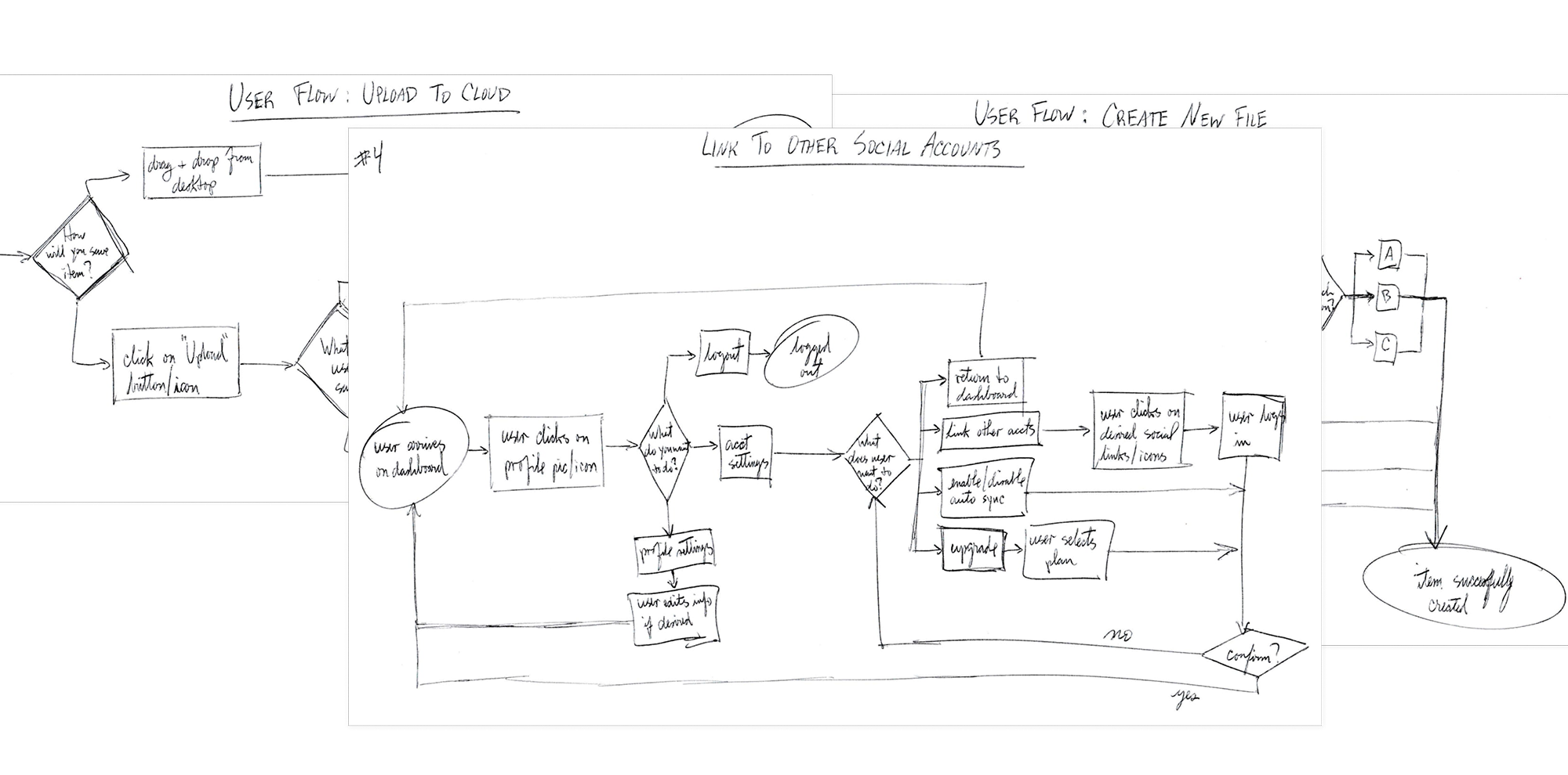
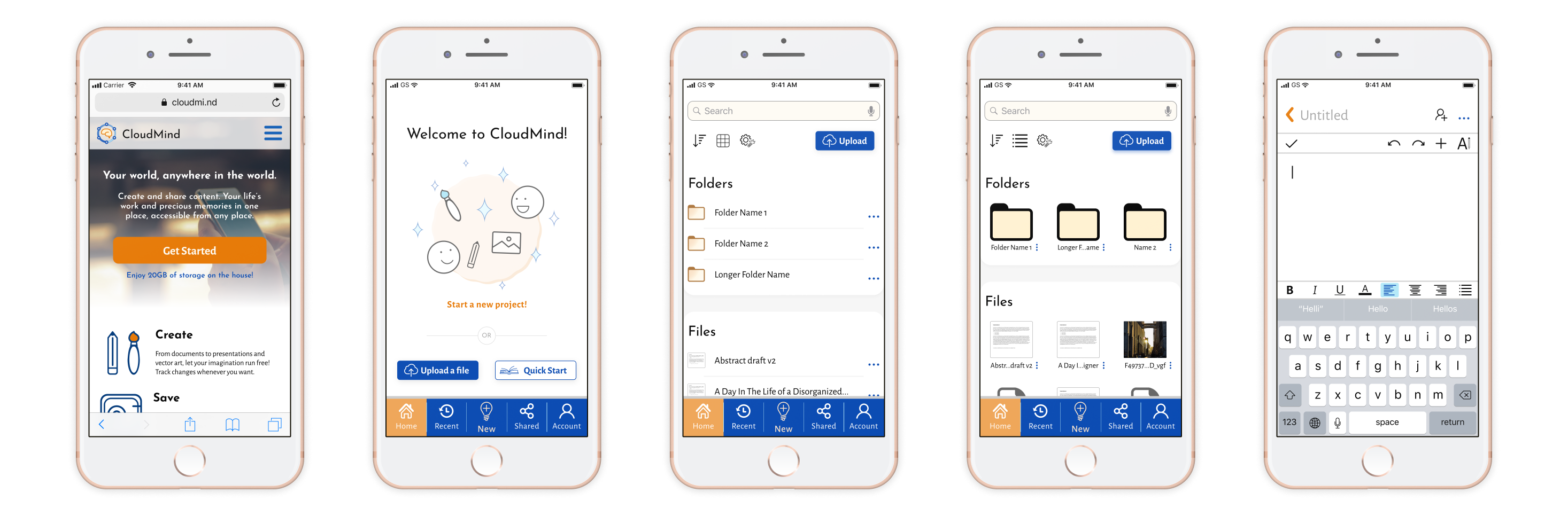
With enough foundational context into the problem and opportunities for entering the CS space, I developed a list of user stories and jobs to be done that can be translated to a minimum viable product (MVP). These tasks, which I incorporated into my flow maps, included uploading a file to the cloud, creating a new file, organizing files, and linking to other social accounts. These tasks both establish the MVP and address CS users' main pain points.
Now the big picture starts coming together. Having an idea of what this new CS service should do, how to do it, and for whom, I sketched out ideas for what the final product could look like. Starting with pen and paper is essential to a smoother design process; it’s better to make mistakes now to save time and resources.
What looks good and practical may not always be so. To gain an understanding of what worked well, what didn’t, and what changes can be made, I conducted tests with users in the same age range as my user
personas to maintain consistency. They felt comfortable with navigating the prototype. However, the following points were noted from these tests and feedback from the lead designer:

After testing the wireframes, I shifted my focus to the product's identity. Other competitors’ logos use a cloud, which inspired some of my ideas. I also wanted to include a visual that conveys collaboration, hence some of my ideas showing connecting dots. I would eventually revisit the logos and designed a new one that was simpler and more easily scalable. These sketches would inform the brand name. My branding decisions were as follows:
Before starting mockups, I played around with the ‘mind’ in CloudMind and included connected dots to signify sharing.
The high fidelity mockups underwent the greatest number of iterations as I sought feedback from lead designers. I iteratively tested the desktop prototype as I felt that the feedback would also inform any tweaks that could be made to the mobile version. Rather than implement prior feedback and creating a Z-shape structure on the homepage, I applied a 3-column approach for the value propositions and plan options to save vertical real-estate and keep a clear structure and visual hierarchy.
Wireframe Iteration
First Hifi Iteration
Latest Iteration
I tested three participants via Figma and inVision and asked them to describe what they liked and what they found confusing or frustrating as they completed three tasks: sign up for an account, create a new document, and recovering an account password. The users liked the homepage layout, and their feedback pointed to two minor discrepancies: make the “Forgot Password” link stand out more (like a button), and give the user control over the confirmation window that shows after requesting a password reset link (different users read at different paces).
I also conducted preference tests on three specific elements in my design: the layout of CloudMind’s features on the desktop homepage, the background of the login and signup overlays on mobile, and the placement of the upload button on the mobile dashboard. All results were split even, and all came down to personal preferences as opposed to any easily identifiable trends. I kept everything as is.
Through this project I found that I struggled with sizing, specifically of fonts and buttons. While working on a frame, one spends so much time zooming in and out that it can distort their sense of sizing. My experience with developing the high fidelity mockup cemented how vital the iterative design and feedback process is. My biggest challenge came during the branding phase; we tend to take the brands we see for granted without knowing what goes on behind the scenes. From this I learned that sometimes good ideas may not come when you need them, but while you apply a metacognitive approach to design, you may begin to uncover new and innovative concepts. It's also important to keep the logo simple for easier scaling and recognition.
The design choices throughout CloudMind’s development felt validated in participants’ feelings during the user tests. It was reflected in their overall positive response to the appearance. The most valuable takeaway was that it takes a village (or at least another set of eyes) to iterate and arrive at a cleaner and well thought-out design; without constant guidance and feedback CloudMind would not look or feel as clean as it does.