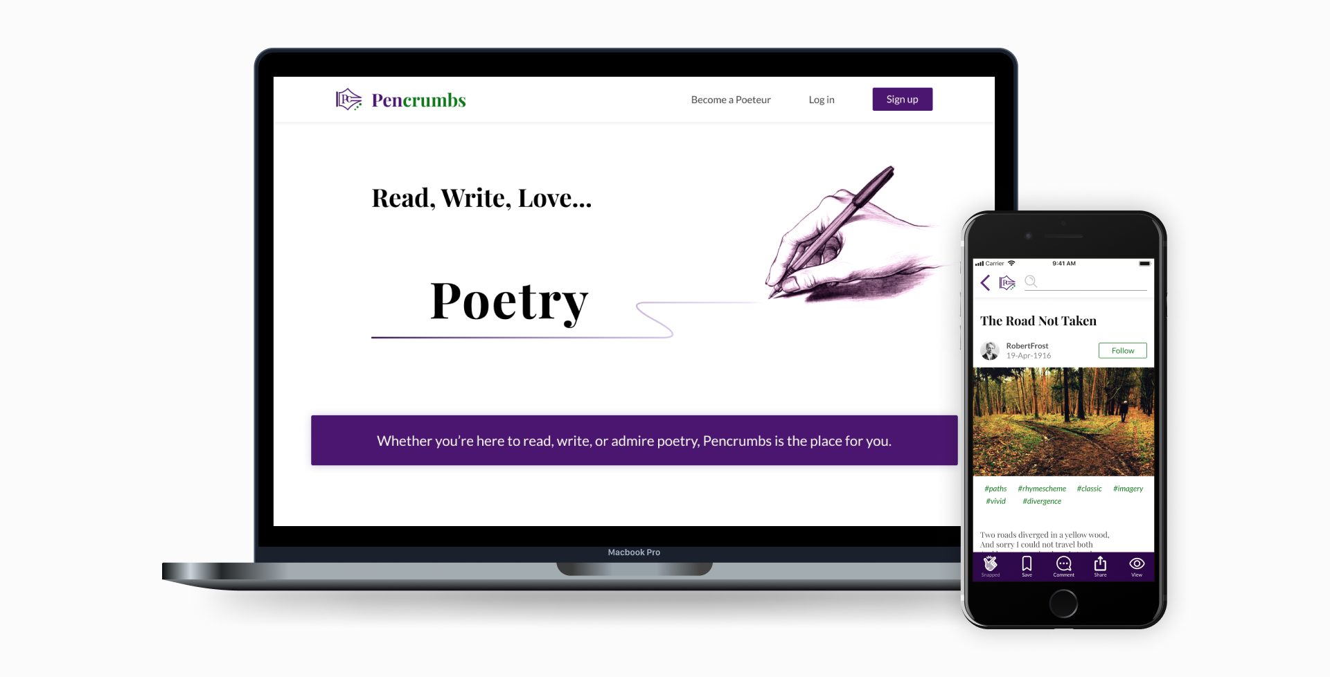
Pencrumbs
A digital haven for poetry creators & readers.
Voted a top project of the week and month on Career Karma!
Voted a top project of the week and month on Career Karma!
Feb 2020 - Mar 2020
Research & Discovery
Info Architecture & Ideation
Interactive Design & Testing
Visual Design
Google Forms
Figma
The Noun Project
UsabilityHub
Poetry aficionados do not have a comprehensive and dedicated resource that helps them satisfy their cravings and guide their writing process. Consequently, they browse the web for various tools and platforms to:
This boils down to the following problem statement:
This boils down to the following problem statement:
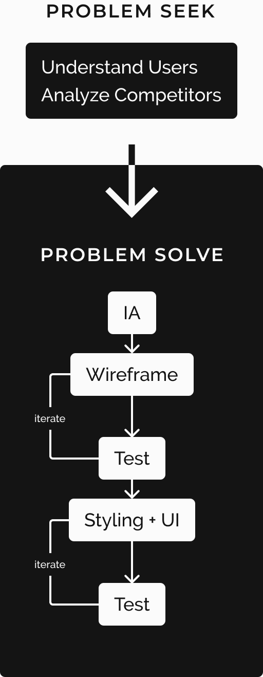
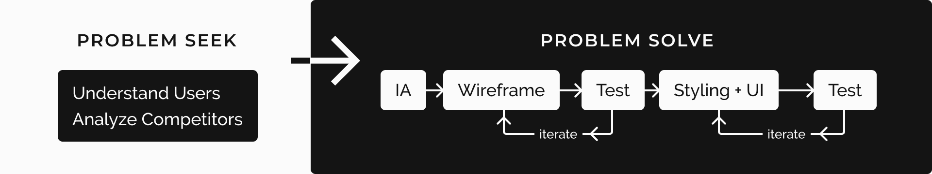
These were my steps for tackling this project:
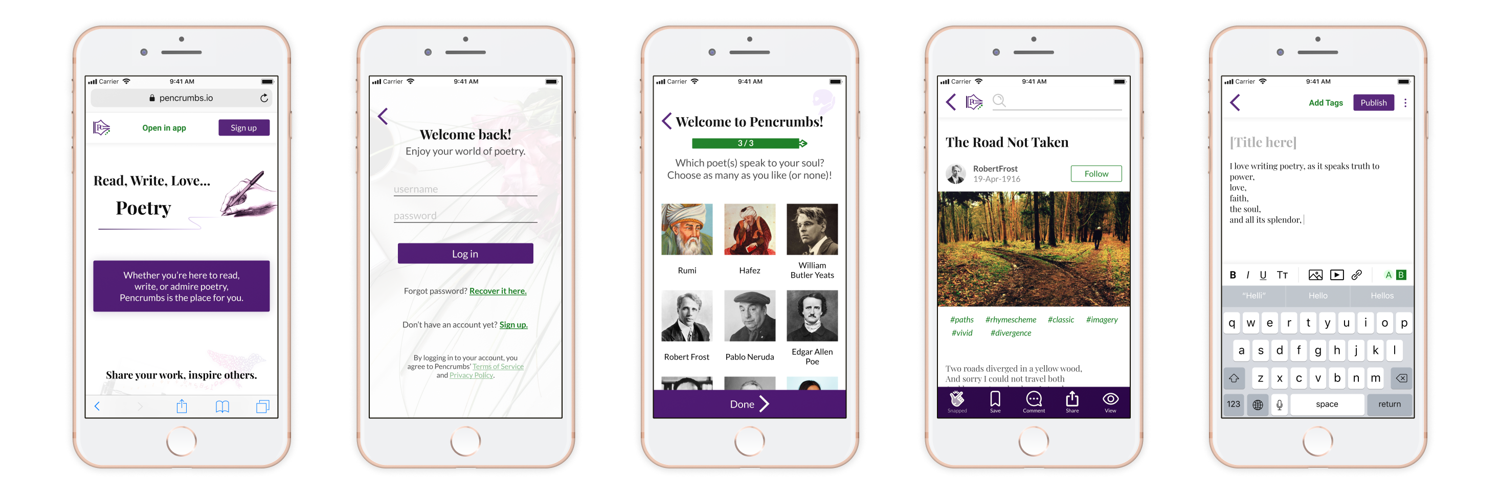
Pencrumbs was designed primarily for desktop devices with a mobile counterpart to provide poetic logophiles a platform for them to share their own poems while reading others' works. By blending complementary shades of purple and green with complementary serif and sans-serif typefaces, Pencrumbs invites users to feel the royalty, wisdom, and mystique of the poetic arts.
survey
responses
user
interviews

I gathered contextual research with user surveys to get a sense of the current landscape of digital literature. Based on a survey of 27 participants, 15 have used digital tools to help with their writing process for the following reasons:
Folks expressed frustration in terms of lack of robust editing features (40%) and sync and accessibility issues (26.7% each). They followed up stating they want a product with comprehensive editing tools and a mobile-friendly layout. Blogs and stories were popular literary styles, while other types weren't as frequently consumed. This is due to a combination of attraction to the format itself, as well as how many platforms exist for blogs and articles.


Contrary to the survey data I gathered, I chose to lean in on a specific literary type (in this case, poetry), rather than directly compete with existing blogging and writing platforms.
I interviewed folks to hear their stories and experiences with poetry, and discovered that there is a desire for a poetry-focused app. Although the survey data shows poetry is not popular when compared to other literary works, anecdotally it was worth exploring this space.
I looked at popular writing and blogging platforms that people use for sharing poetry, as well as a lesser known poetry-focused tool to determine what each product does well and what it lacks. I noted the following points across these competitors:
Keeping the pain points and desires I discovered in my research in mind (e.g. wanting robust editing features, saving, sharing, and having access to a collection of works) informed what I wanted this product to accomplish. Among the list of user stories I created, I prioritized the ones that were pivotal in establishing a minimum viable product. These included starting or resuming a draft, viewing featured pieces, setting rhyme schemes, and bookmarking pieces. My flows integrated as many of my user stories as possible to test general functionality, while other stories would be included in future iterations.
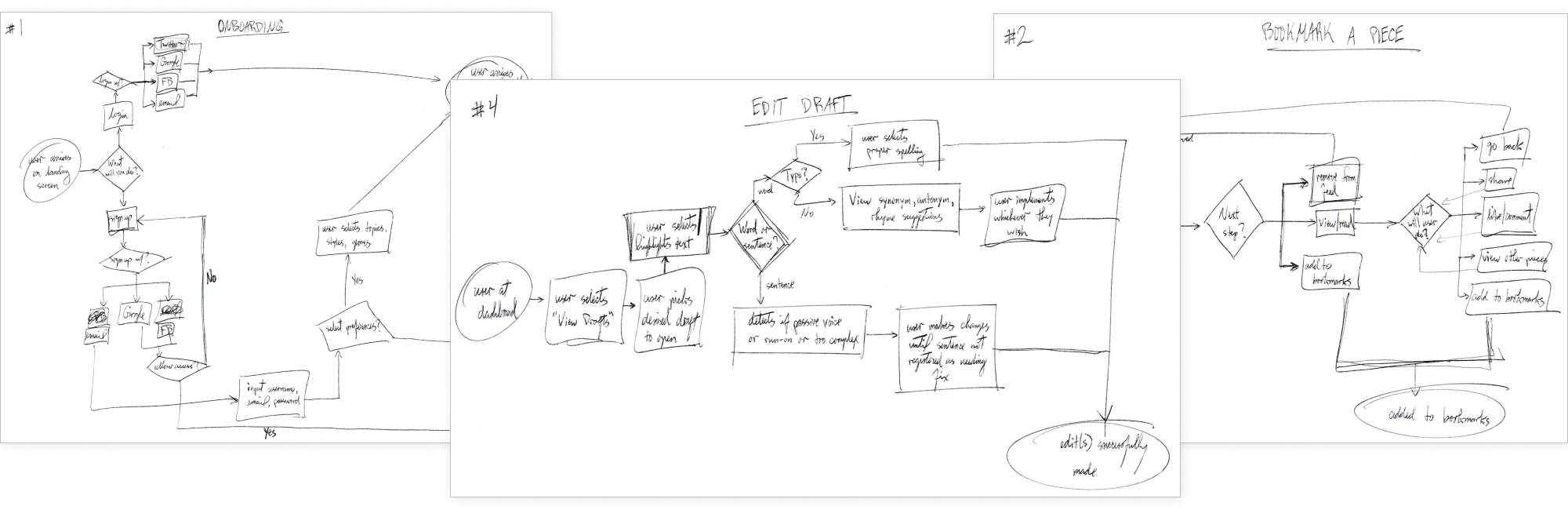
I took pen to paper to brainstorm my vision for this app, then digitized it on Figma and tested its functionality. Since 80% of survey participants indicated they write on their PCs, I tested my desktop wireframes and made any applicable changes to the mobile version. I noted the following points of feedback from user testing:
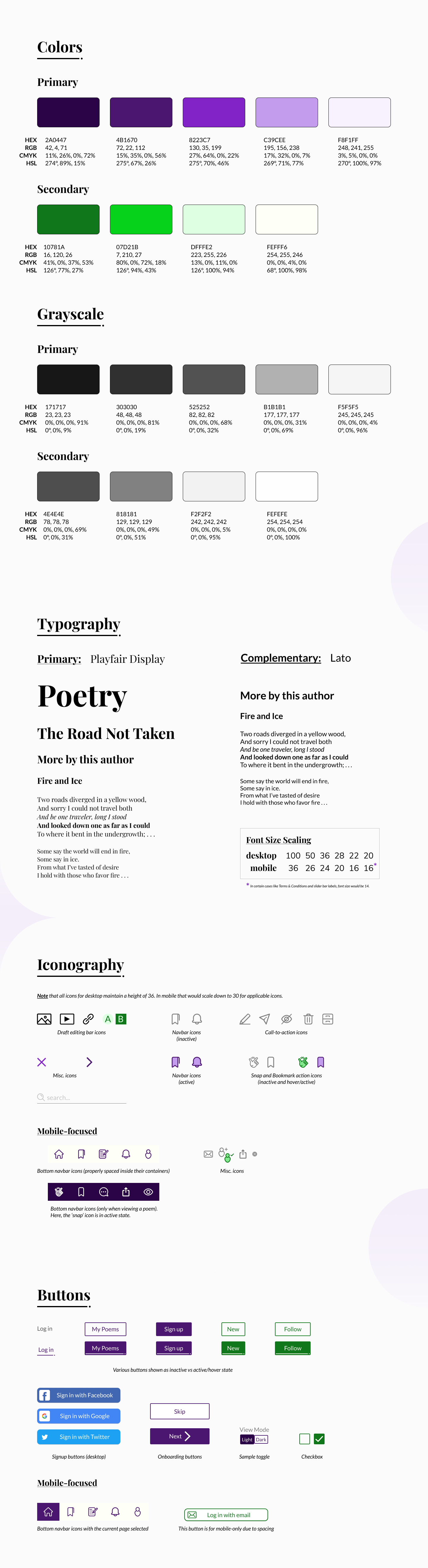
As far back as my user interviews, when I found a need for a product dedicated to poetry, I began contemplating the brand identity and settled on Pencrumbs. Poems are bits and pieces put together to form a magical and expressive piece, and I wanted the name to represent that. My branding decisions were as follows:
Time for a fresh coat of paint! I took my branding guide and applied it to my wireframes to create the first iterations of Pencrumbs’ final design. In the spirit of maintaining consistency, I once again tested my desktop prototype for feedback since this would be the more popular version. Overall, users enjoyed the look and feel of the app (especially the landing page). However, no design is perfect, as evidenced by the following feedback:
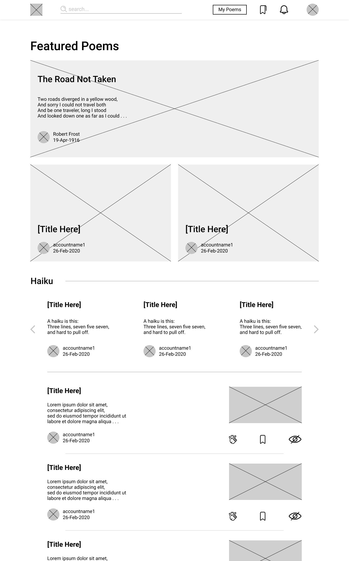
Wireframe Iteration
First Hifi Iteration
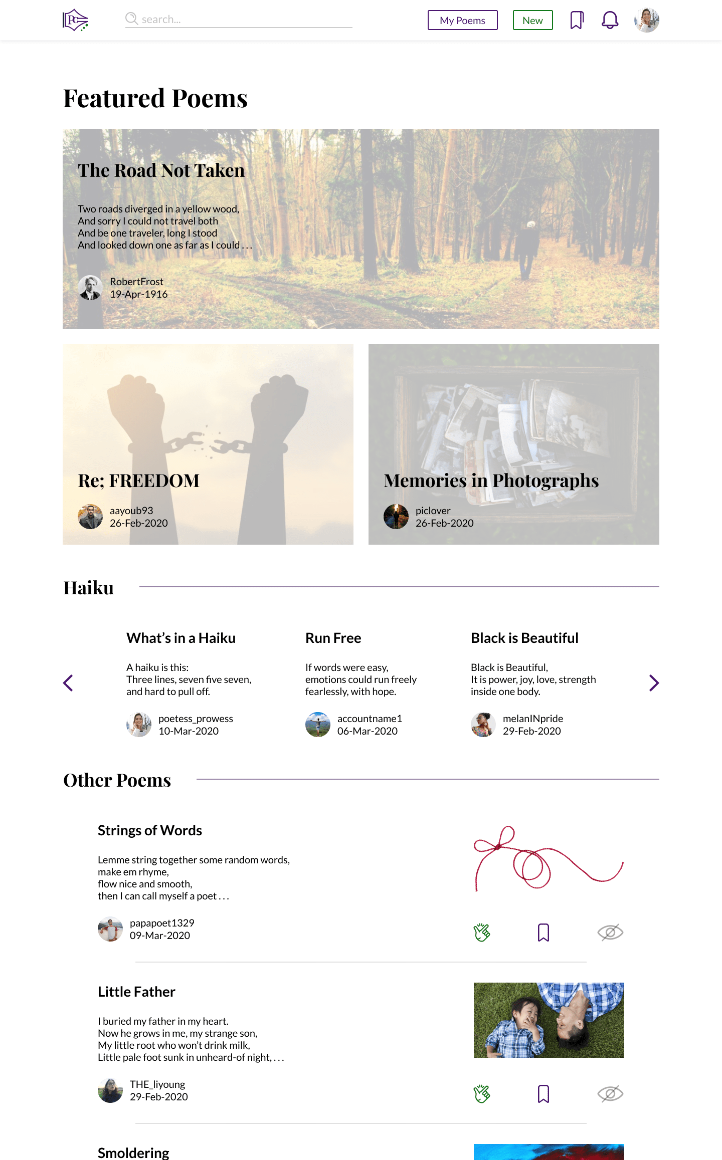
Latest Iteration: Mood & Recommendation Cards
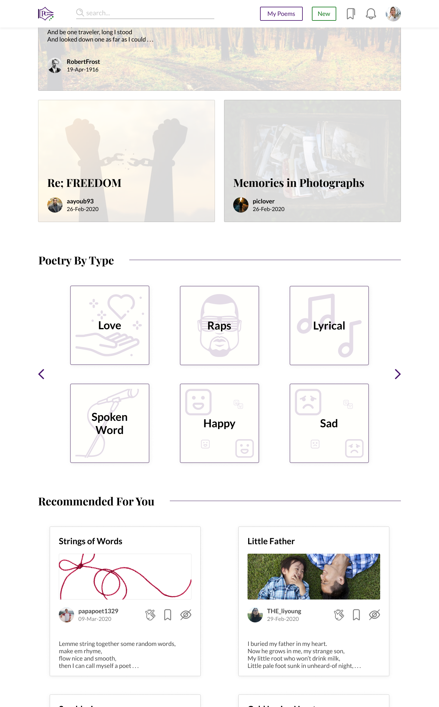
As with prior tests, I applied the feedback I received and re-tested the desktop prototype. Users said they were more eager to explore poetry by type and mood, since the cards grabbed their attention as they scrolled down the page. They were also happy to see how integrated the various writing tools were available when writing a draft. I then took these improvements to the mobile prototype.
Narrowing down my focus to a subset of literature was a decision that paid off. In hindsight, it made more sense to design a poetry service than another catch-all service in a space where so many others exist. It was more fruitful to explore a space that hasn’t been given enough attention. Spacing was tricky to nail throughout this project despite how confident I felt. I was originally adamant about using an analagous color palette but found myself struggling more. To solve this, I decided to go with a purple-green complementary palette which worked better.
There is plenty of room for improvement and expansion of this prototype to include other core user stories. I would start with implementing the ability to clip or highlight certain lines of a post. That way, readers can build up a collection of inspiration, further customizing their experience. I would also explore adding writing challenges and prompts to get writers' creative juices flowing. But, as it stands now, Pencrumbs accomplishes its primary goal of breaking into the poetry space and offering users a bold and reliable service in creating and satisfying their poetry wants and needs.