Adobe hosts workshops on creating designs and acclimating designers with Adobe XD's features via creative challenges on Behance. Here are some of my works!
Trying a purple-themed dark mode sci-fi social media app for a multi-day Behance Creative Challenge.
An experiment in light-mode neumorphism in a music player for a Behance Daily Creative Challenges.
Exploring Adobe XD plugins to speed up designing a workout app for a Behance Daily Creative Challenge.
Implementing scroll groups to create an interactive map of sweets shops for a Behance Daily Creative Challenge.
A couple of friends and I challenged ourselves to use a set of randomly generated colors to create a design. Here are some of mine!
The first thing that came to mind when seeing this color palette was the twilight sky fading into nighttime. So, why not make an app related to nighttime (in)activities? Thus, Sleepify was born, and was voted best design out of all submissions for that round! I experimented with the following tools & tricks:
Green is such a nourishing color...and it also happened that I was hungry when starting out this design! So it only made sense that I create something related to green foods.
Green is such a nourishing color...and I happened to be hungry when starting out this design. So it only made sense that I create something related to green foods: green and leafy veggies! I wanted to keep this concept simple while playing around with these techniques:
A couple of friends and I challenged ourselves to identify a UX or UI artifact that we could iteratively improve on, and try our skills. Here are some of my works!
I love Liverpool FC dearly but hate how its homepage looks, Liverpool's current homepage looks outdated, unfocused, and subpar for a 6-time Champion's League winning team. I observed some other teams' sites (Aston Villa, ManC, ManU, and Tottenham) to see what they do well, which inspired my proposed redesign of Liverpool's homepage.
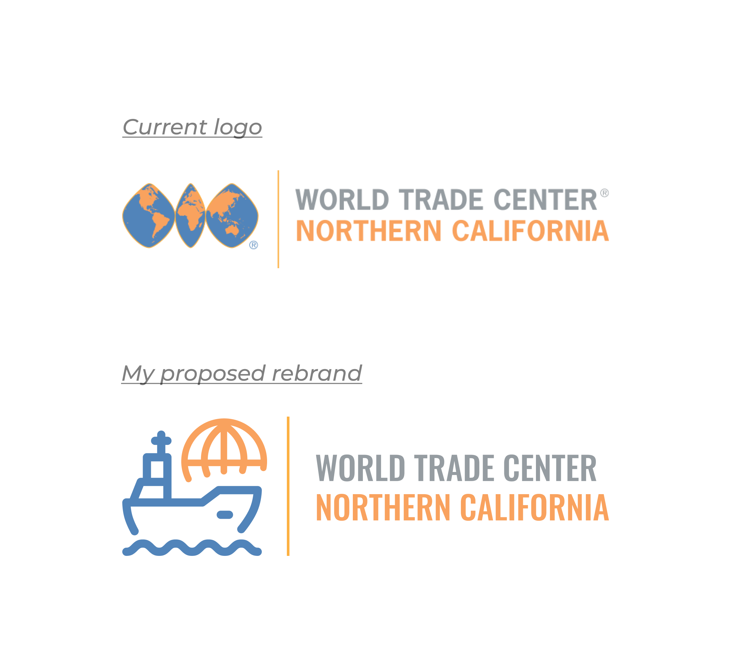
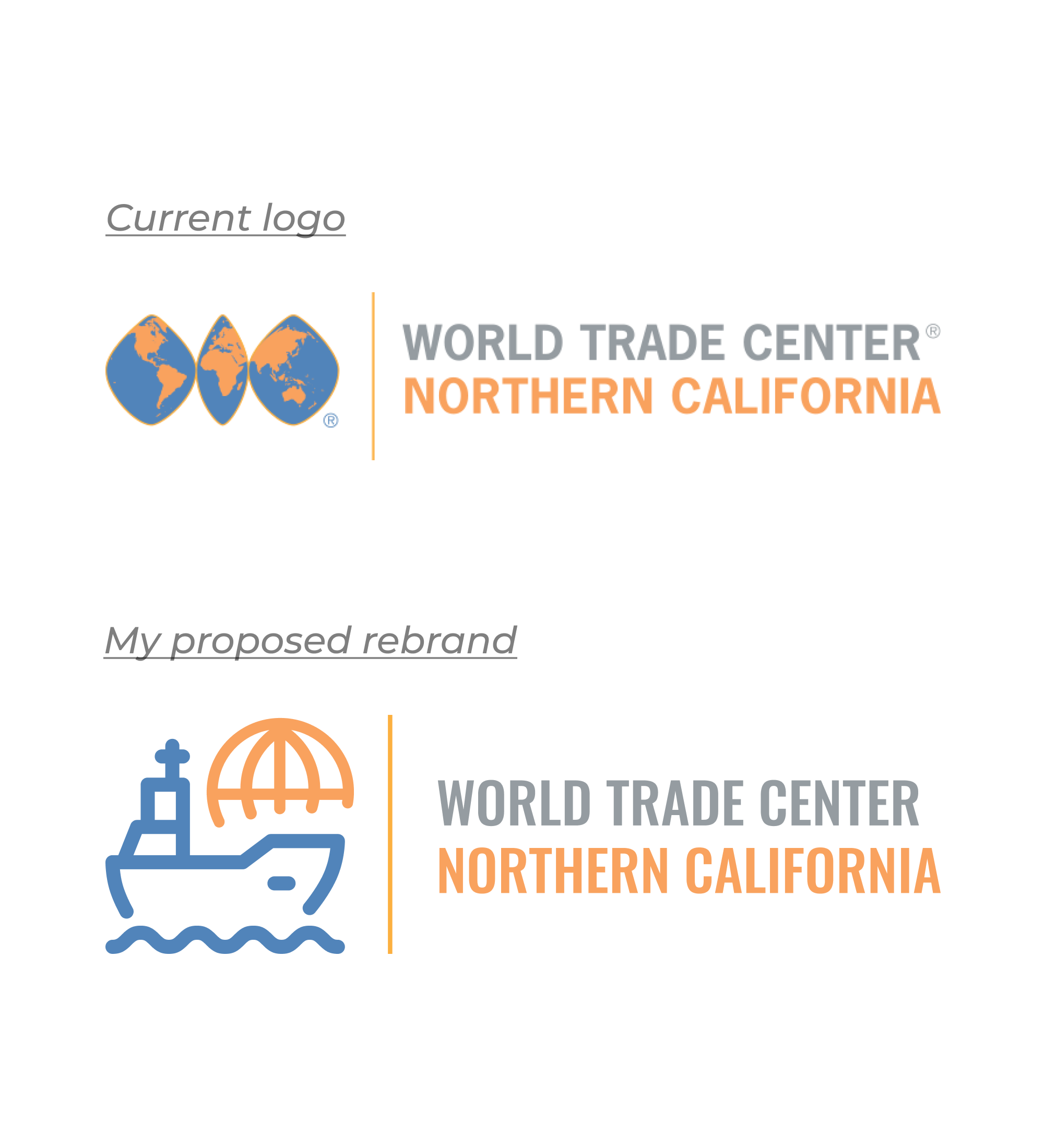
Upon first seeing World Trade Center's logo, it felt like something was missing in what the organization is about. Seeing a 2-D globe doesn't give too much context; as such I saw room for improvement. I subbed in a simpler globe icon in place of the current more complex globe, to maintain WTC's global presence. I then included a cargo ship to more clearly drive home WTC's expertise in trading throughout the world.